One of the first things to consider when starting a brewery is the branding and marketing of your beer. It is right up there with brewing good beer and balancing the books and other things you really want to do well.
Marketing is the way that the general public get to know about your beer. For a small brewery this means Facebook, Twitter, a website, beer blogs both your own and through other people (why do you think I'm writing this?), meet the brewer events etc. For big breweries it involves aspirational TV adverts and sports sponsorship. Marketing is a strategy and perhaps in another blog I will get into it in more detail, but I want to go on to talk about branding.
Branding is a subset of marketing and is most important at the point of sale. Many punters, in the absence of any prior knowledge about the beer, will pick an interesting looking pumpclip or a good looking bottle. What better way of marketing your beer then to have people buy it, try it and talk about it?
So what branding have we got at Weird Beard Brew Co? Well as you will see the branding has evolved somewhat from fairly basic beginnings.
The first thing was the name. This was an incredibly difficult thing to get agreement on. Weird Beard has had a few people involved with the project over the year or so we have been thinking about it.
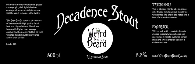
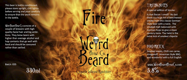
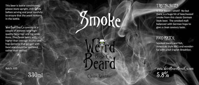 Trying (and failing) to move away from the James Bond look. I thought how I could remove the Circle with a dark background. Make a negative of the logo? Perhaps but instead I found some interesting wallpaper and gave this a go. I really like the effect of these two labels and they make a coherent pair. Now I just need to convince Bryan that a Rauchbier seasonal (and a chipotle rauchbier) will sell well. I also think smoke and fire would translate to T-shirts very well.
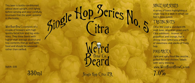 Get picture of hops; crop to size; add overlay with 75% opacity; get something quite interesting. Can easily be changed in colour for others in the series.
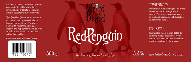 Final tweaks to date. I added a dummy barcode and in response to other feedback reversed the brewery name and beer name positions. Not 100% sure if this is an improvement. Strangely I did not want to use Redpenguin or Dredpenguin as a brewery name but a beer name....that is a different matter.
Is it better to have the beer name prominent or the brewery name?
I'm sure that the branding will continue to evolve. Any and all feedback is welcome and I will of course do a follow-up post closer to launch time with our launch range of beers and labels.
Marketing is the way that the general public get to know about your beer. For a small brewery this means Facebook, Twitter, a website, beer blogs both your own and through other people (why do you think I'm writing this?), meet the brewer events etc. For big breweries it involves aspirational TV adverts and sports sponsorship. Marketing is a strategy and perhaps in another blog I will get into it in more detail, but I want to go on to talk about branding.
Branding is a subset of marketing and is most important at the point of sale. Many punters, in the absence of any prior knowledge about the beer, will pick an interesting looking pumpclip or a good looking bottle. What better way of marketing your beer then to have people buy it, try it and talk about it?
So what branding have we got at Weird Beard Brew Co? Well as you will see the branding has evolved somewhat from fairly basic beginnings.
The first thing was the name. This was an incredibly difficult thing to get agreement on. Weird Beard has had a few people involved with the project over the year or so we have been thinking about it.
We have a file with over 75 possible names in there that we considered. Some of those that got more than 10 seconds of thought are below:
Second Chapter (People may remember Tony Lennon @tony2taps tweeting about this)
Rhythm and Brews
Weird Beard Brew Co
Square Mile
Great Fire Brewing Co
The Craft Brewery (to annoy all the people who don't like the name craft beer)
Artisan Beers
Artisan Beers
Studio 56 Brew Co
Happy Bat (Yes Stig @thehappybat was involved as well)
Big Smoke
South Bank
Thames Brewery
Borough Brewery
Another Brewing Company ("can I have another beer please?")
Elephant's Trunk
New Agenda
SE1
Inner City Brew Co
Urban Brew Co
The 4 Idiots that can build a brewery but not think of a name brew co.
HELL FIRE!
We gave those in bold a bit more thought but it was only when it was down to Bryan and myself that Weird Beard Brew Co came out as a clear favourite. This was helped by Bryan going out and with the help of a mate designing a logo that worked:
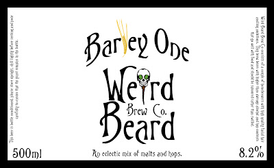
Armed with a logo it was easy for me to dive into Photoshop and start designing beer labels for our homebrew beers. The font is sometimes know as Tim Burton but also the freely available as Trinigan FG and made for good title text.
The goal was for simple and striking. First feedback was writing text telling drinkers to store the beer upright should not be written vertically! Also note my (bad?) habit of replacing letters with clip art.
A few tweaks later, we had this. A version of this label had won the label competition at the LASECB Festival. Feedback on this label was good, but a few people complained about amateur look to it. The black and white printed at home look to be exact. Looking back I am not sure I agreed at the time but certainly do now. However a retro label may be in order if we do this beer as a special.
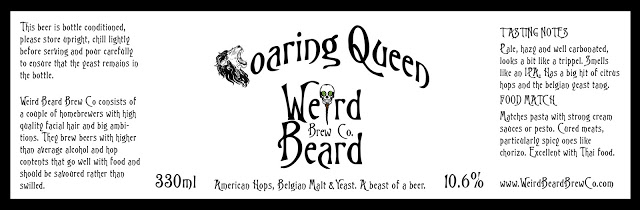
Again the attempt was to be simple and striking. I guess you can see Marble and Otley influences in this especially, although others have mentioned James Bond. Another change was to lose the fancy font for much of the writing, making it easier to read and allowing us to put it in a smaller font giving more space.
Is it better to have the beer name prominent or the brewery name?
I'm sure that the branding will continue to evolve. Any and all feedback is welcome and I will of course do a follow-up post closer to launch time with our launch range of beers and labels.